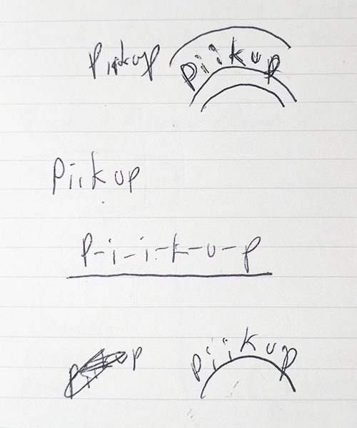
Client: Piikup
Project: Identity Design
Role: Art Director / Designer
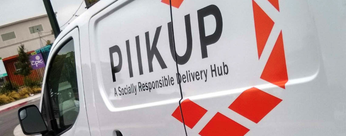
This client is a local startup feel-good story. Winner of the “Social Change Maker Award” at the 2017 Oakland Indie Awards, this client launched a delivery startup that specializes in local e-commerce deliveries and pickups. She describes her startup as, “A Socially Responsible Delivery Hub”. This client was expanding her business model and her current branding was limiting in a number of ways. She was looking to broaden her brand appeal, clientele, and funding.
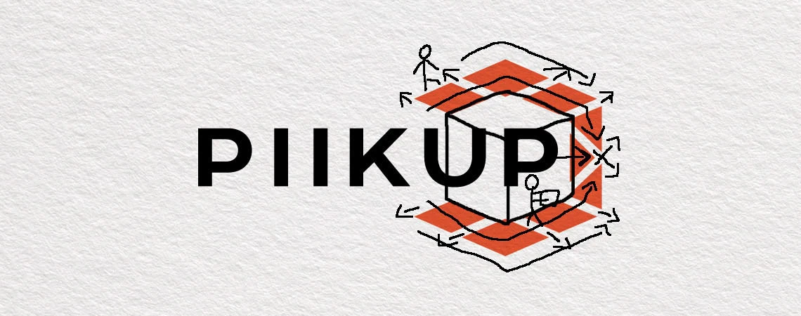
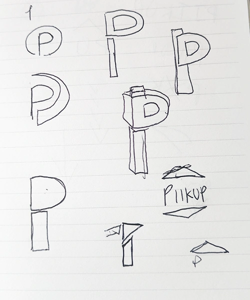
The client preferred a font and logo that was thin and somewhat “playful” but still serious. I kept this in mind as I focused on creating ways to translate the hub aspect of the design. During the creative process, I came up with a concept that would meet these goals.
I started with several sketches. If we look at the logos of the top companies in this field we will see the use of arrows and direction in their design (FedEx, Amazon, UPS).

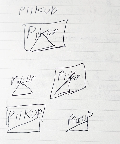
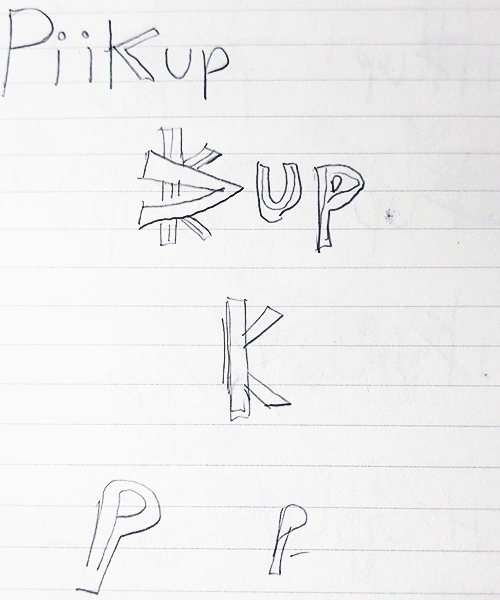
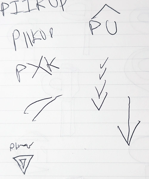
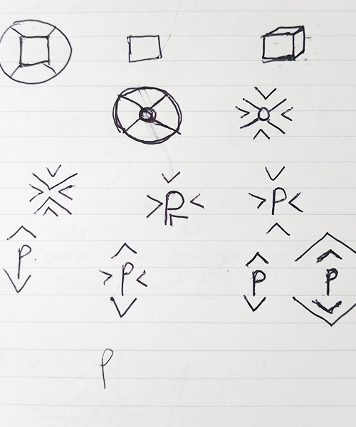
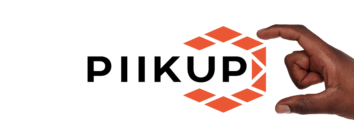
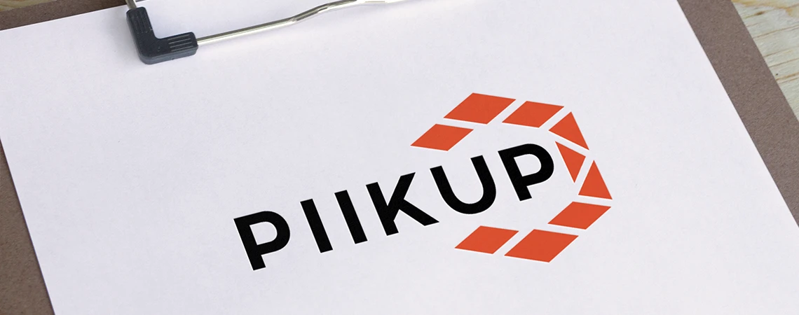
FINAL DESIGN
The final logo design is somewhat of a “quadruple entendre” because it represents: a box, directional planes, a hub, and a play on the word “pickup”.