Client: Insane Cycling & Fitness
Project: Rebrand
Role: Art Director / Designer
This client recently changed their business name from “Spinsane Cycling” to “Insane Cycling & Fitness”. The term “Spin” is trademarked and their existing business name was becoming a legal problem. The client provided me with a graphic that was being used as the new logo but it was not well put together. I created new brand colors, and logos, and updated their current 1-page website with the new changes. The “S” from the main logo design also works as a secondary logo. This secondary logo looks great!
Original Logo
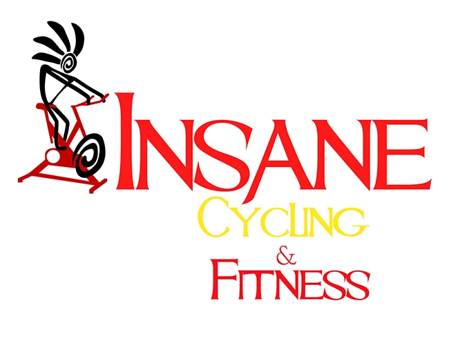

FINAL DESIGN
The client’s old logo (shown above) had a certain edge to it and some bold styling. The client also provided me with an image that included a small graphic and a gothic-style font that they were thinking about using as the new logo, but it was not usable as a logo as is. However, it was a style that they were fond of. I felt that the font was a great fit with the word “Insane”. The font seemed to convey something that will be crazy, dangerous, or horrifying. Not exactly fitting for a cycling class. My approach was to use the same typeface but to modify it to make it less scary-looking and more inviting. Aside from the typeface, I also felt the need to change the colors for the brand.

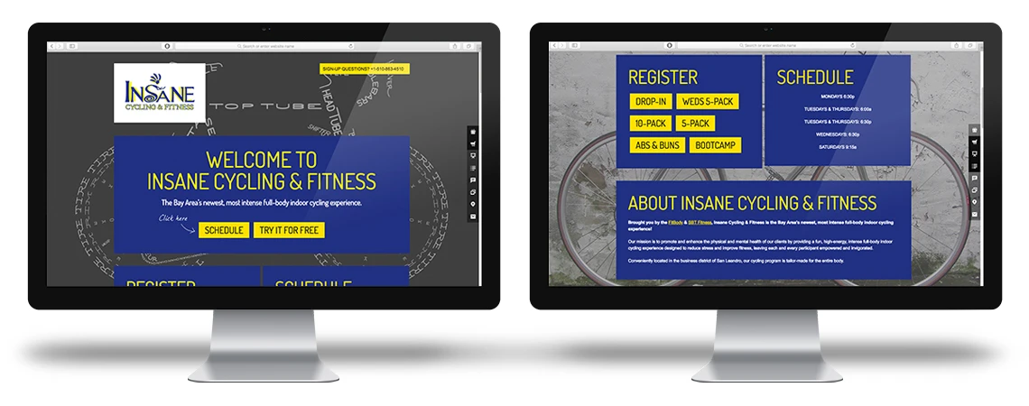
WEBSITE
This client’s existing one-page website needed updating to the content, class scheduling feature, and color updates to reflect the new brand colors. I completed all the steps necessary to update the website by utilizing WordPress, CSS, and HTML. The client wanted to complete the changes fast to have a fully rebranded, functioning website available for their existing and new members.