YOUR FAVORITE SHOW (MAYBE) REBRANDING
I created this page to show some insight into my design process. A website portfolio is typically full of finished designs. Let’s all start at the same place: the beginning. Time for a rebrand of the fictitious company, “Dunder Mifflin” from the American TV show, “The Office”.

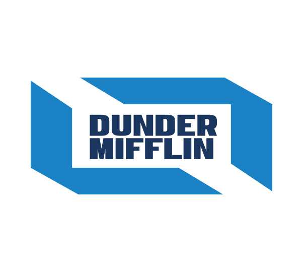
ORIGINAL LOGO

The original logo typeface is “Impact”, which is an outdated (and previously overused) font.
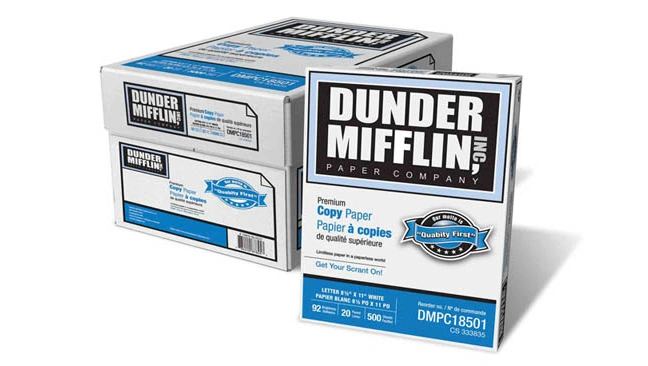
In November 2011, Staples Inc. announced that they are selling their own product of manufactured paper under the “Dunder Mifflin” name, under license from NBC’s parent company, Comcast. The Dunder Mifflin products are produced and sold by Quill.com, a wholly owned subsidiary of Staples. As of July 2018, Quill.com no longer carries the products, listing them as having gone on “permanent vacation.“
COMPETITORS
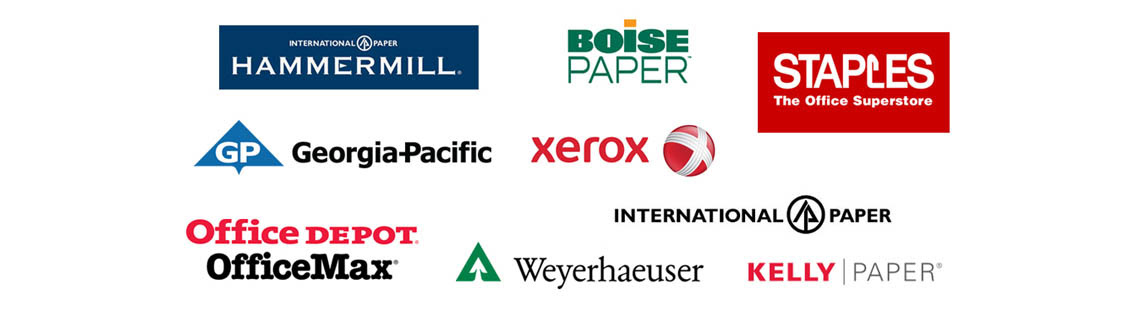
Take a look at the image below. It shows logos of some well-known brands in this space. How do their designs compare to the original Dunder Mifflin logo? How do they compare to the design concepts in the following section?
CONCEPTS
Imagine that Dunder Mifflin is a real company that sells paper products in a store near you. The company is looking to redesign/update the company logo. The logo will appear on paper products, websites, apps, uniforms, and marketing materials. The original logo is popular… so maybe the new design should not stray too far from the original design? Or should it? New colors or remain black, white, and gray?
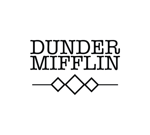
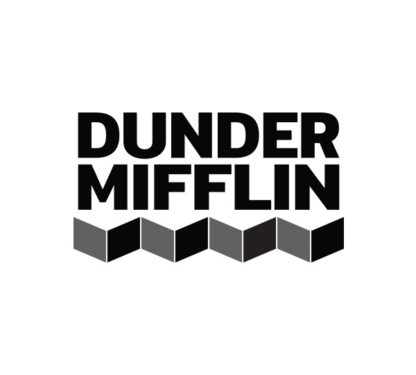
Here are some of the first logo “concepts” that I came up with. The logo design process is fun but it can also be challenging. Put yourself in the mind frame of the team tasked with deciding the direction of the new brand for the Dunder Mifflin Paper Company. Which design do you like the best?
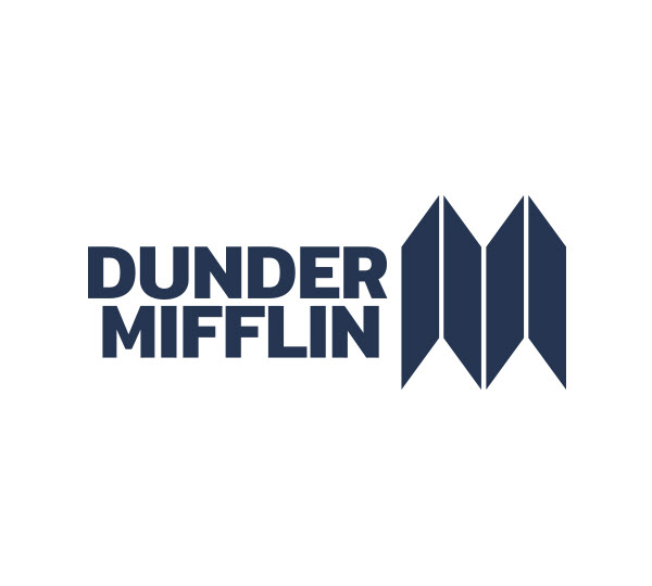
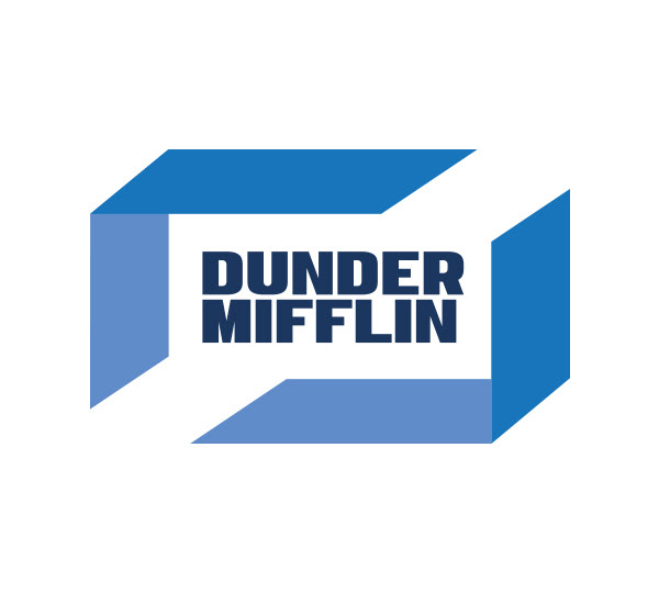
FAVORITES
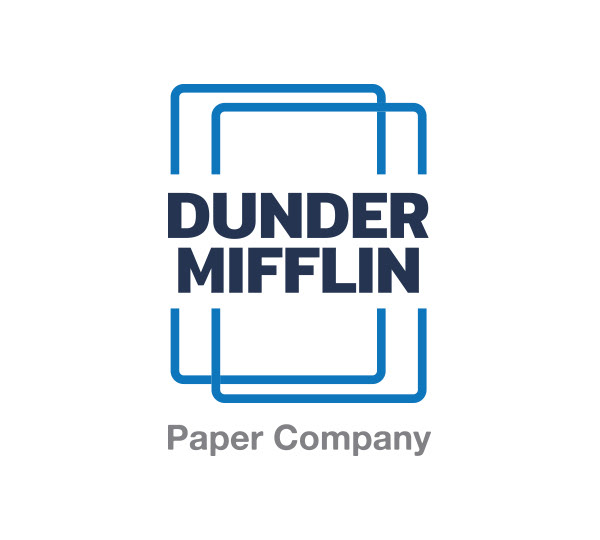
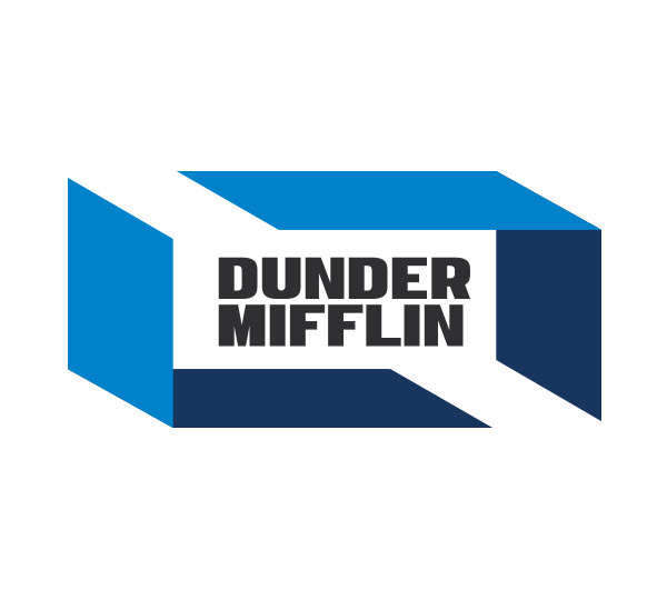
You can’t pick them all. In this case, I narrowed it down to four designs.
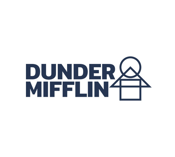
FINAL DESIGN
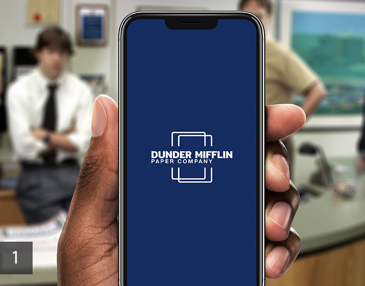
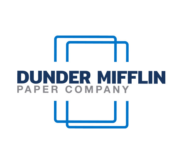
Logo (1) makes me think about blank sheets of paper and has a clean design. It’s one of the concepts that already feels the most complete (doesn’t always mean it’s the best) and doesn’t need to be worked out further. The 3 colors work well and overlapping paper sheets in the design add some flair.
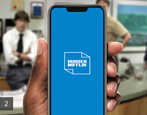
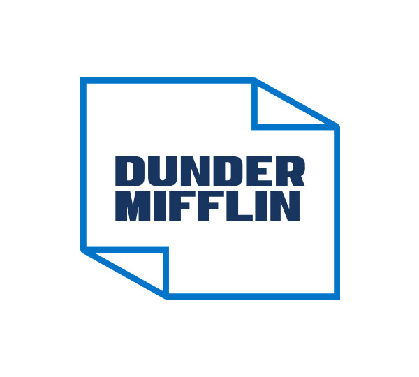
Logo (2) is also one that feels complete already. It is closer to the style of the original but it adds additional dimensions to the classic design of the original logo. Paper, multiple sheets of paper, and a box can all be seen in the design.
The concepts are different but also have similarities. Which logo design would you select?